The HUB is a centralised internal portal for employees of Jacobs Technology to easily access all of their resources and share interesting materials from one place.
Client
Jacob Technology - Birkenhead, Merseyside
Jacobs Technology are a fintech startup specialising in the design and development of software and systems for the enforcement industry.
Jacobs Technology are a fintech startup specialising in the design and development of software and systems for the enforcement industry.
Roles
Jason Cham - Project Management and UX Research & Design
Ellie Bowen - UX Research & Design
Chris Mackin - UI Design
Ellie Bowen - UX Research & Design
Chris Mackin - UI Design
Results
• Increased productivity and efficiency from employees;
• Less time required for onboarding new employees;
• Improved collaboration between disciplines and team members; and
• Centralised and consistent processes and procedures.
• Less time required for onboarding new employees;
• Improved collaboration between disciplines and team members; and
• Centralised and consistent processes and procedures.
Project Background
At the time, Jacobs Technology were a specialist sector within Jacobs Enforcement, an organisation that provides enforcement services to over 165 local authorities within England and Wales.
The technology team had expanded rapidly from a number of 4 to 15 people within the space of only 2 years. Unfortunately the rapid growth was not reflected in the department's organisation of resources. Each discipline within the department had their own unique way of documenting processes or storing resources and materials with no consistency or standardisation.
Project Goal
The brief was to create a centralised online area for all disciplines within the technology department to easily access resources such as standardised work instructions, policies and links to web apps & websites. We were given only 2 months to complete the project from conception through to the live product.
The Execution
I kicked off the project by conducting an interview with the Head of Technology to capture and understand the project requirements.
User Profiling
As the users for the system were the technology team, Ellie and I found it relatively straight-forward to profile the target audience, define the contexts and create 3 personas, 1 for each of the different types of users for the system.
We then held an empathy mapping workshop with the entire development team to delve deeper into each persona and get them invested into the target users. The session uncovered some interesting insights into what each user might do, say think or feel as well as any pains and gains.
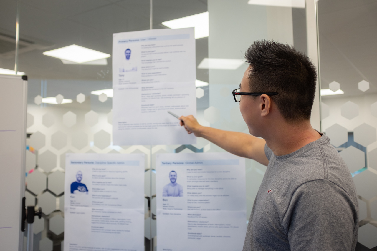
Presenting the personas in the empathy mapping session.
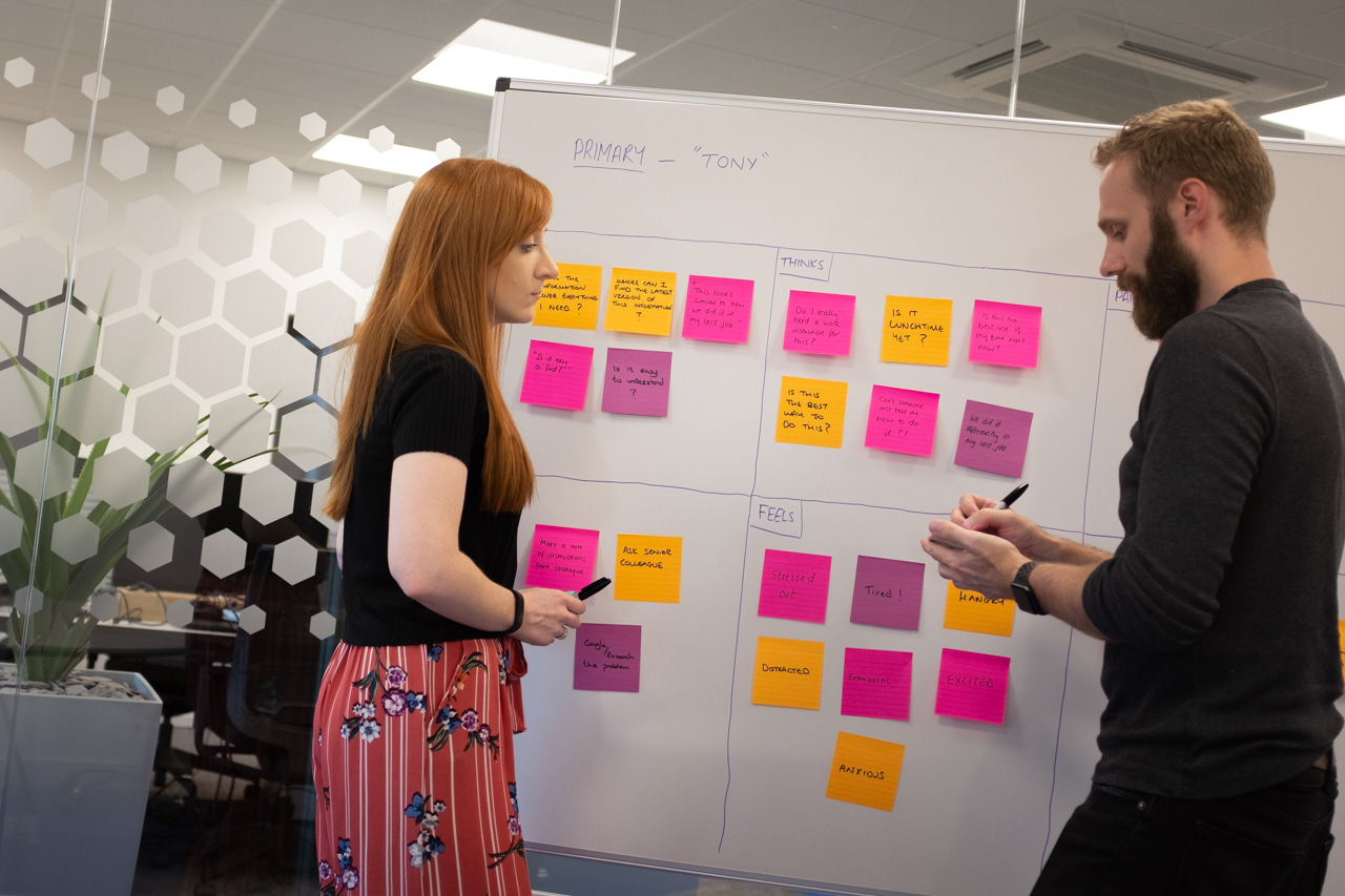
Brainstorming during empathy mapping.
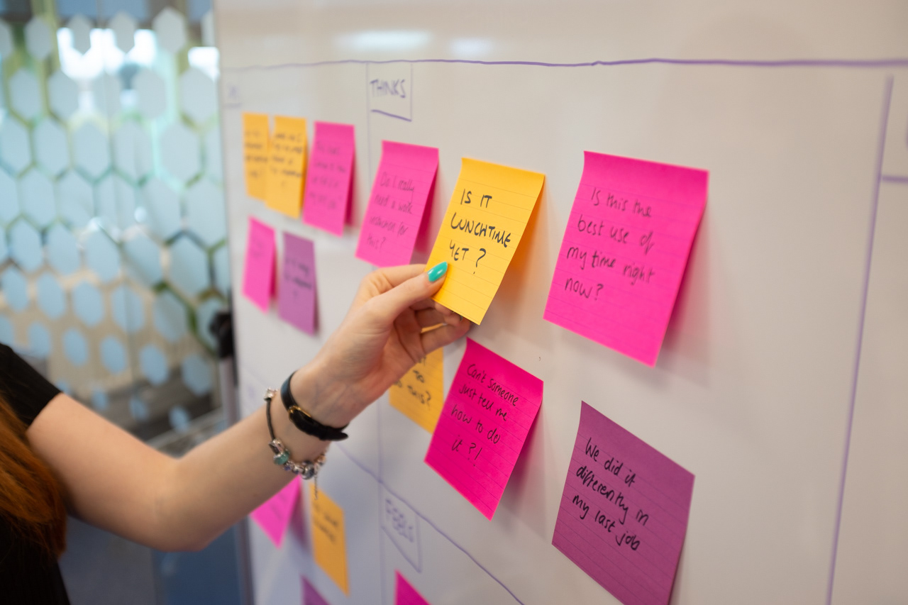
Adding post-its to the board in the empathy mapping.
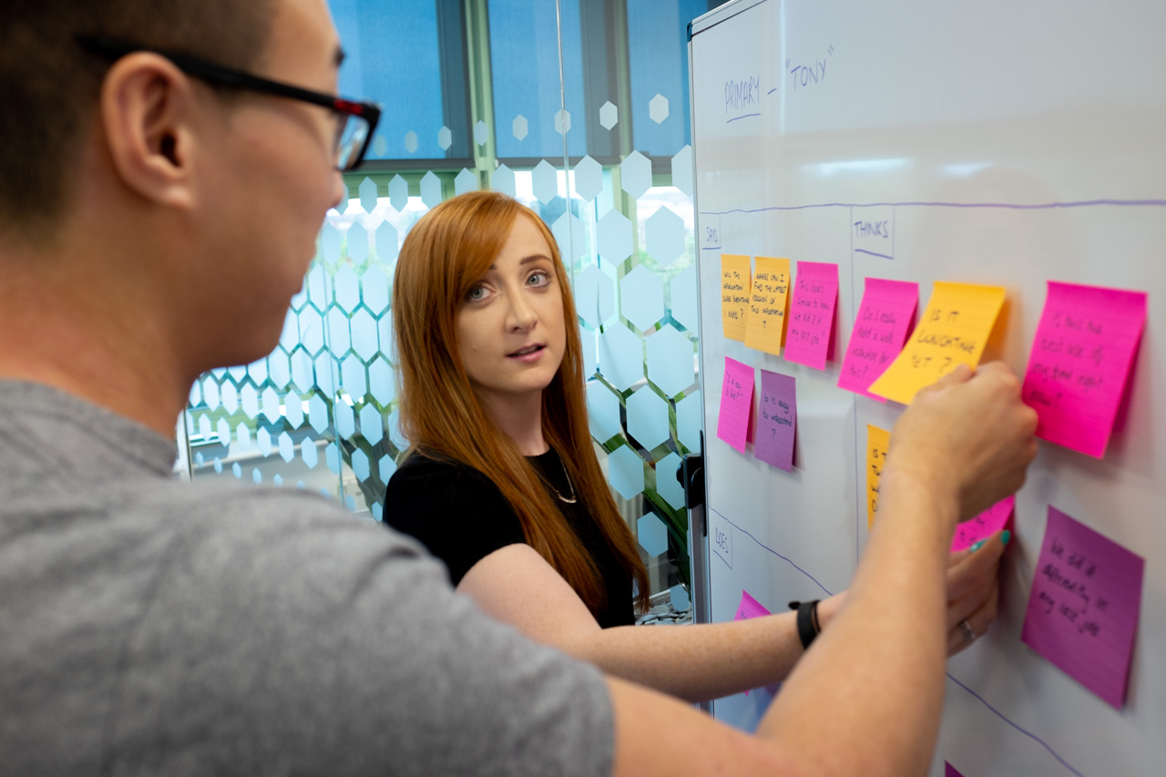
Discussing results from the empathy mapping.
User Flows, Content Models and Wireframes
The next step was to determine the flow that each user might take through the system. Ellie and I worked together to create a user flow diagram which included all 3 user types.
The user flow diagram created of the HUB system with all three user types.
We then hosted a design workshop with Chris where we all sketched wireframes and content models of the various screens. Once we all had numerous ideas down in paper, we compared each of our designs and shortlisted the best elements. From this we then collaboratively refined content models and wireframes to a point where we were all happy.
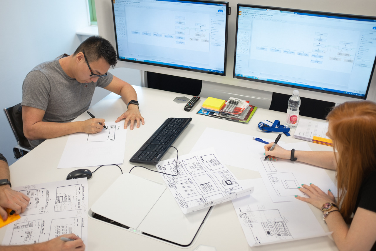
Content modelling and wireframing workshop.
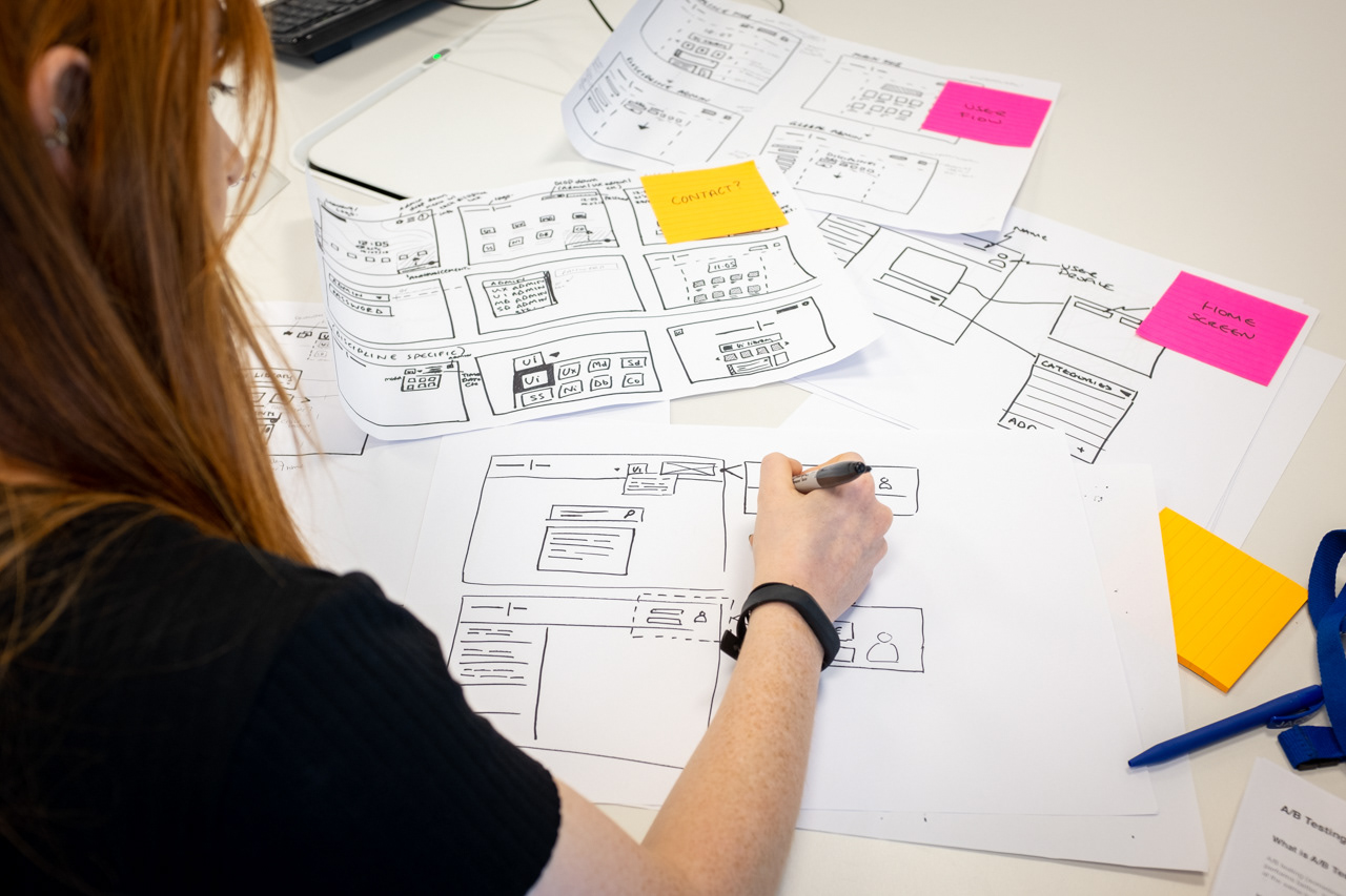
Sketching wireframes of the HUB interface.
The digital wireframes of the HUB system.
Prototyping
I then digitised the wireframes into Adobe XD and added interactions between the screens to create a low fidelity prototype.
Testing
Due to the tight deadline of the project, I decided the best way to test the prototype would be through un-moderated remote testing. I emailed all team members within the technology department with a short summary to the project, a link to the prototype along with a list of tasks to complete and finally a short online questionnaire which asked them how they performed on the tasks along with their opinions and suggestions to improve the design.
The pros and cons of doing remote testing were:
Pros:
• the prototype was tested on all 15 team members within 2 days;
• the prototype was tested on each team members' unique computer set up in the intended environment; and
• all team members felt more comfortable not having to carry out the test in a lab environment.
• the prototype was tested on all 15 team members within 2 days;
• the prototype was tested on each team members' unique computer set up in the intended environment; and
• all team members felt more comfortable not having to carry out the test in a lab environment.
Cons:
• we were not able to see the body language or facial expressions of team members during their tests;
• we were not able to control the test environment meaning team members may have been distracted by interruptions;
• the quality of the comments and suggestions on the online questionnaire were varied with some being very vague.
The overall feedback received however was positive with the addition of a number of great ideas such as:
• adding a global apps area which would include web apps used by all the development team;
• including favicons for the bookmarks so that they are easier to distinguish between each other;
• integrating Spotify so that team members can play their music directly from the system; and
• including the ability to have customisable backgrounds along with a light and dark mode of the interface.
User Interface Design
The next phase of the project involved updating the designs and refining the user interface design from the suggestions and feedback of the usability testing and then working with Chris in order to create a high fidelity prototype. We followed the Atomic Design methodology which involves breaking a website down into its basic components, which are then reused throughout the system. This made it easier for the developers to code the system.
The UI guidelines created for the system following the Atomic Design methodology.
The themes that were available for the user to customise their own interface.
Development
After the prototype was handed over to the systems developers, we worked closely with them during the development phase, periodically carrying out QAs (Quality Assurance) to ensure the system looked and functioned as intended in the designs. The system was developed to be responsive and mobile friendly.
Deployment
The system was deployed and was adopted by all team members as their home page, with all resources, web apps and web links accessible from one place within 2 months of the project starting.
The responsive mobile version of the HUB system.
A mock-up created to show the responsive mobile version of the HUB.
Evaluation
The project was a great test to see if my UX process would work. Although we were only able to carry out a slimmed down version of the process, it was clear that having a process helped with keeping the project on schedule to within two months.
It was also clear that the process didn't have to be followed strictly and depending on the project, the team and the users, we could allow for variation.
Overall the project was successful and we were able to deliver it within the deadline and on specification.
